Approach
004
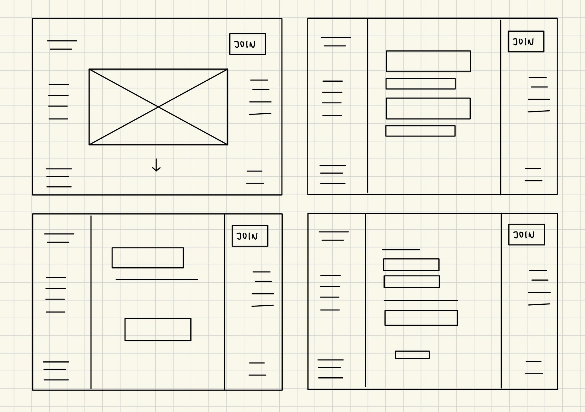
Structuring the app with a side navigation bar allows the user to move throughout the website quickly and
accurately. Real-life applications of this include Notion, Figma, and Github Docs to name a few.

I wanted to take a "more is less" approach. Which is how I created the design system below. The Ysabeau SC
font is minimal yet speaks loudly. Its powerful in the way that isn't screaming, but it's
sleekness and sharpness gives it authority.
The intended users are busy either running a company, playing a sport, or building a business etc, the goal
of the website is to allow the user to get in and get out. Find exactly what they want with ease without
feeling overwhelmed.
——— My Idea
Page
Button
Key
Aspen
AUTOMOTIVE
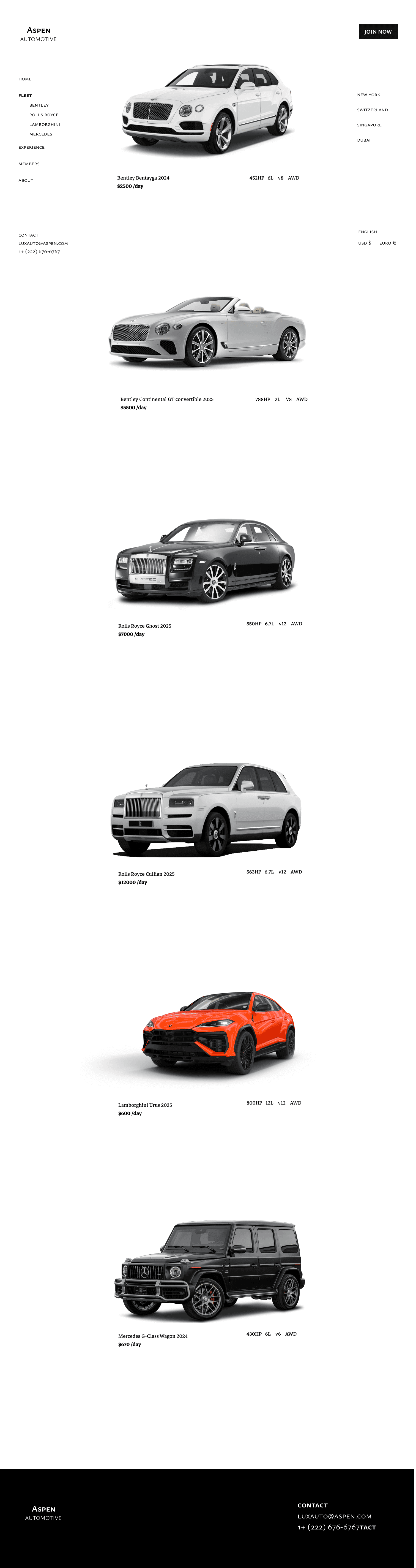
Mercedes
Rolls Royce
Expereince
Home
Fleet
Members
Submit
About
Bentley
Lamborghini
Join Now
Aspen
AUTOMOTIVE
—————
Design Challenge: Create a single landing page for a prospective
CEO billionaire! Design a single hi-fi landing page for his company
that specializes in a sports car rental agency.
Figma
Procreate
Framer
Toolkit
Team
Role
Skills
Charlie Wang
UI/UX Design
Prototyping
Identity Branding
Lead Designer
ASPEN

AUTOMOTIVE

My Role
001
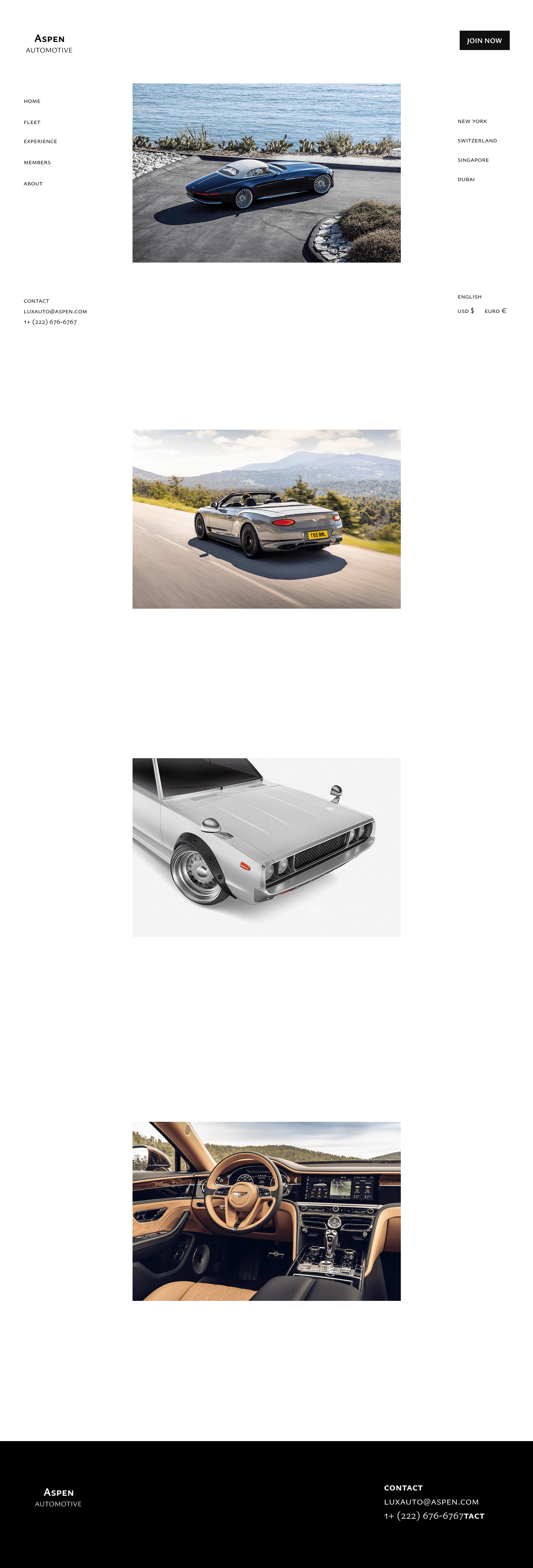
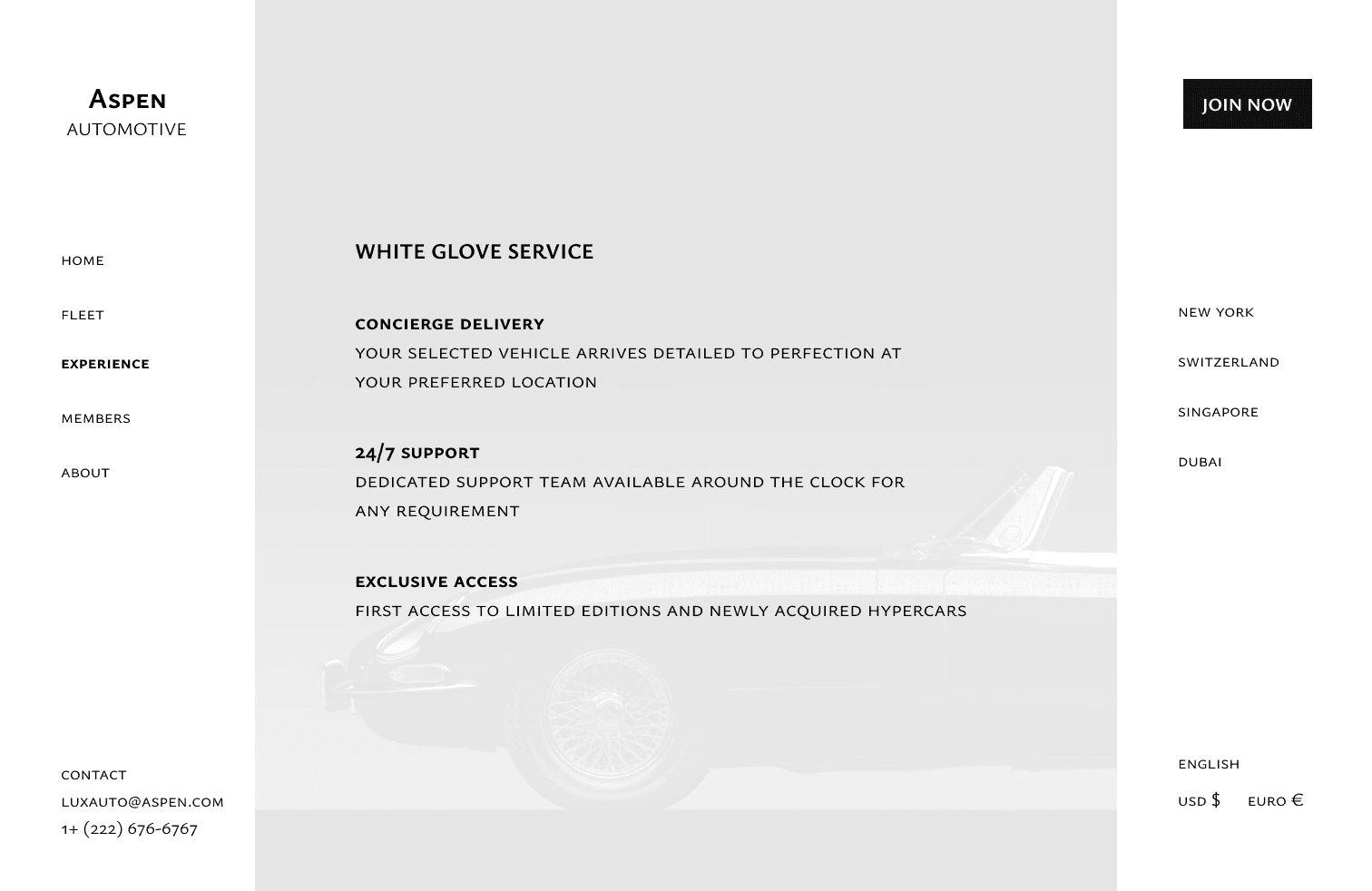
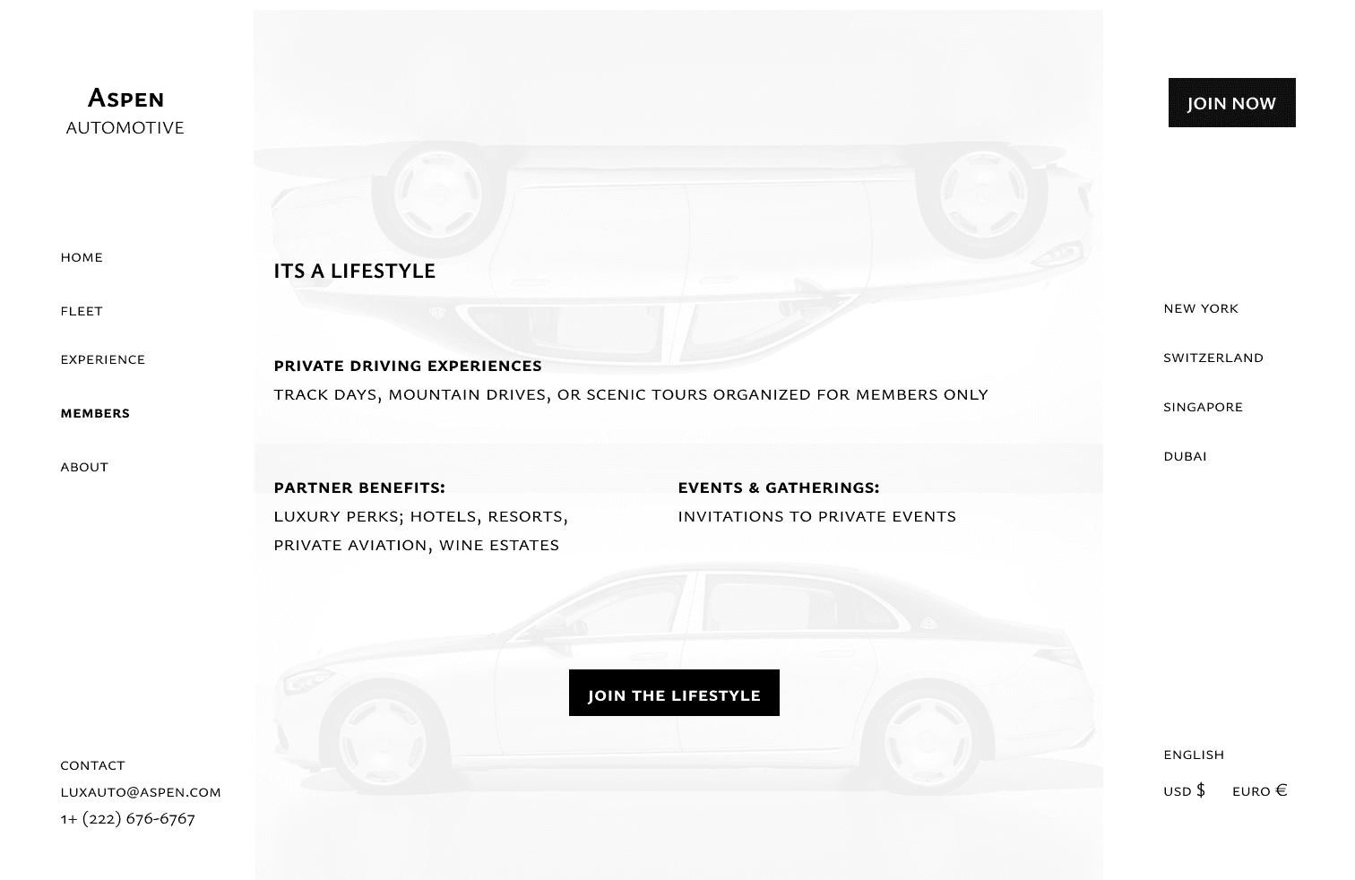
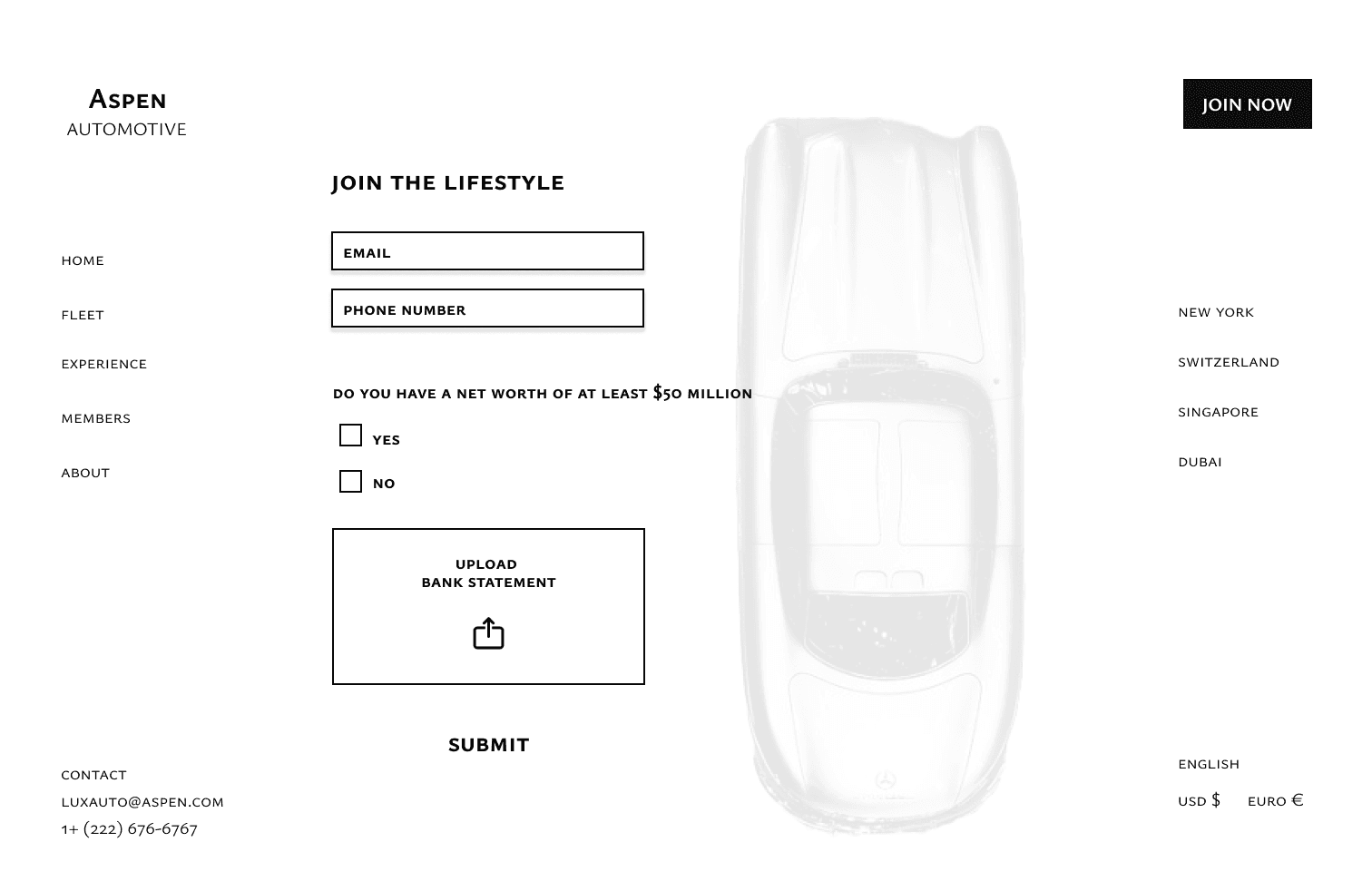
My vision was a modern, minimal, and sleek layout that highlighted the cars. Given the prompt I wanted to create
a website that screamed luxury and exclusivity. Which is why there is no chekout rather than an application to
join the automotive club
Product Preview
002
Timeline
003
This Gantt timeline outlines my workflow across Discovery, Design, and Delivery, showing how research,
user flows, and system planning progressed into wireframes and eventually low- and high-fidelity designs.
It highlights how each task overlapped and built on the next throughout the sprint.
Ideation & research
Low - Fidelity
User flow & mapping
Design System
Wireframes
Hi - Fidelity
Interaction/Prototype Design
DISCOVERY
DESIGN
DELIVERY
Sep 9- 10
Sep 11 - 12
Sep 13
Takeaways
006
——— Balance
——— Differentiate
——— Design System
This project taught me how to balance luxury branding, clear usability, and modern interface
patterns within a single high-impact landing page. Designing for a fictional billionaire CEO
pushed me to think at a higher level of refinement, precision, and intention.
By choosing a fixed sidebar, I learned how persistent navigation can enhance accuracy and
ease of movement through a website. The static left panel grounded the interface, giving
users a reliable anchor while allowing the center content to scroll freely. It reinforced how
navigation patterns shape the user’s mental model and browsing speed.
Products like Notion, Figma, Github Docs, and Airbnb dashboards rely on side navigation
because it supports:
Persistent visibility of key actions
Fast, accurate access to core sections
Better scalability when additional pages or tools are added
Vertical scanning, which aligns with how users naturally read lists
A stable anchor, especially in high-information environments
Applying this to a luxury car rental company reinforced how a sidebar can elevate the
experience by creating a sense of structure and professionalism. It made the website
feel more like a premium dashboard than a simple marketing page matching the
expectations of a high-end clientele.
I learned how to express “luxury” not through excessive ornamentation, but through
clean typography, strong contrast, and generous white space. Every visual decision had to
feel intentional and premium, reflecting the identity of a high-net-worth client.
Design Process
005
——— Low Fidelity and Wireframes
After user journey mapping, I created low-fidelity user flows to turn concepts into actionable
designs.
——— High-Fidelity
——— Lets take a closer look
——— Product Walk-through